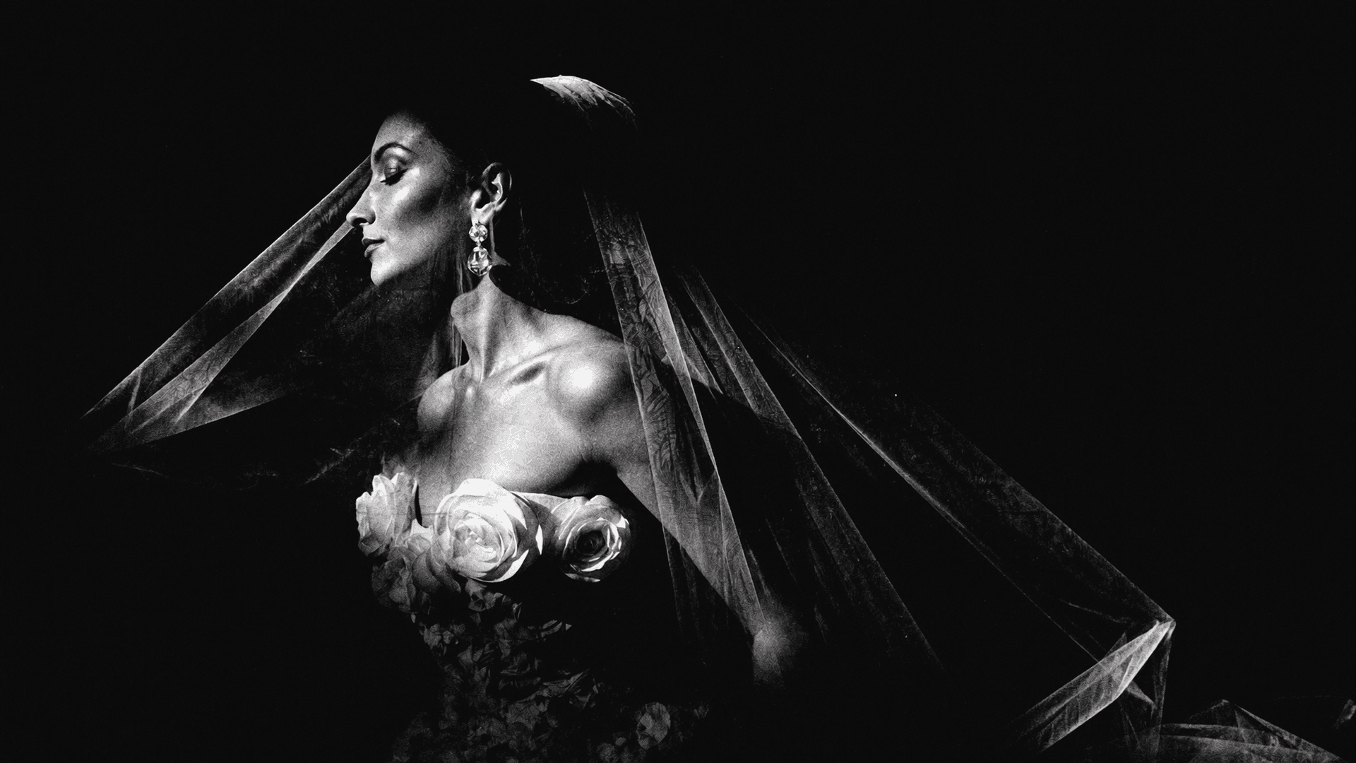
The over-warm, faded-highlight, desaturated-shadow look that dominated wedding photography through most of the 2010s and early 2020s was a specific aesthetic choice that got applied so uniformly that it stopped being a choice and became an assumption. If you hired a wedding photographer during that period, there was roughly a 70% chance your gallery was going to look like every other gallery from that year — regardless of your dress color, your venue, your location, or the actual light of your actual day.
The Knot is now naming true-to-life color as a 2026 trend. I want to explain why this matters photographically rather than just aesthetically.
Color Is Information
Your dress was a specific color. The flowers you chose were a specific shade that you looked at for months before selecting them. The walls of the venue had a specific character — warm terracotta, cool stone, white plaster, deep wood. The candlelight at the reception had a specific temperature. All of this was intentional. All of this communicates something about your taste, your choices, and your day.
When a preset flattens all of those colors into its own predetermined palette — when every dress reads as the same washed-out cream, every flower as the same muted pink, every stone wall as the same warm tan — the intentionality of those choices disappears. The gallery loses its specificity. It could be any wedding.
The Destination Wedding Argument
This is where the stakes become highest. Destination weddings are chosen specifically because the location has a particular visual character: the deep terracotta of Cartagena's walls, the green of MedellÃn's mountains, the blue of the Adriatic visible from a Puglia rooftop. These colors are the visual argument for the destination. They are the thing that makes the photograph provably from that place.
A heavy preset that imposes its own palette on top of those colors undoes the destination. The Cartagena image looks like it could have been made in Cancún. The MedellÃn portrait could be anywhere warm. The work of the location is erased by the work of the preset.
What True-to-Life Actually Means in Practice
It does not mean flat or cold or unprocessed. Truly skilled editing enhances what was actually there — deepens the warmth of actual golden hour, renders skin tones accurately across a range of complexions, preserves the specific quality of candlelight. The result is images that feel both beautiful and honest. That look like the day, not like a mood board.
That is what I have always tried to make. I am glad the broader conversation has caught up.
Destination Wedding Photographer
Vancouver · Medellín · Worldwide


